
Introduction
Time series analysis and forecasting are fundamental fields used by data scientists and other related roles to study trends. They are also among the most common projects that you may undertake in your current job. Today, the purpose of this post is to conduct a comprehensive analysis of a time series dataset and then discuss the key considerations to be made after implementing your machine learning algorithm or other forecasting methods.
Exploratory Data Analysis
An exploratory data analysis for a time series is similar that any other kind of dataset, the first step I take is understand all the fields and the purpose of the dataset. For this case I will use a sample dataset from kaggle that contains data from electricity consumption in UK along 2009 to 2023, which is one of the best topics to study and understand time series. So let’s load dataset and check it:
#Load data
data = pd.read_csv("./data/historic_demand_2009_2023.csv", index_col=0)
data.info()
After load our dataset, we have a shape of 262944 rows, 22 columns and no duplicated values. Nevertheless, we can see that more than 50% of total rows is null for 4 fields, so we can obviate it.
Now, it’s time to pay attention to frequency of the records and at this point, you have to choose if you want to analyze by days, hours, weeks or any other option. This is one of the most important questions you have to ask yourself, the frequency you choose will provide the optimal performance in your model based on the size of sample and detail you want to analyze. In our case, we chose days frequency and now, our dataframe seems like:
data["settlement_date"] = pd.to_datetime(data["settlement_date"])
data = data.groupby(["settlement_date"]).sum()
data = data[["nd","tsd"]] #National Demand and Transmission System Demand
Once we have our dataset ready with the fields to analyze and the date field at the index, I suggest you to check normality and homocedasticity contrast, to be sure that our dataframe has the required characteristics to forecast a time series.
Check normality is very simple and a lot of libraries such as Scipy, Statmodels or Matplotlib can help you with this purpose. Now, we will use Statmodels to get Kurtosis and Skewness values, which are two measures of simmetry and heavy-tailed or light-tailed relative to a normal distribution. Skewness is a measure of symmetry, or more precisely, the lack of symmetry (A distribution, or data set, is symmetric if it looks the same to the left and right of the center point) and Kurtosis is a measure of whether the data are heavy-tailed or light-tailed relative to a normal distribution (That is, data sets with high kurtosis tend to have heavy tails, or outliers).
demand=data["nd"]

fig,ax = plt.subplots(1,2,figsize=(14,4))
sm.qqplot(demand, fit= True, line  = "q", alpha = 0.4, lw= 2, ax= ax[0])
ax[0].set_title("Grafico Q-Q de la demanda de energía", fontsize = 10, fontweight ="bold")
ax[0].tick_params(labelsize = 7)

mu,sigma = stats.norm.fit(demand)

x_hat = np.linspace (min(demand),max(demand),num=100)
y_hat = stats.norm.pdf(x_hat, mu, sigma)

ax[1].plot(x_hat, y_hat, linewidth=2, label="normal")
ax[1].hist(x=demand,density=True, bins=30,color="#3182bd",alpha=0.5)
ax[1].plot(demand, np.full_like(demand, -0.01), '|k', markeredgewidth=1)
ax[1].set_title("Distribucion de la demanda de energía")
ax[1].set_xlabel("National Demand")
ax[1].set_ylabel("Densidad de probabilidad")
ax[1].legend()


print("Kursotis:", stats.kurtosis(demand))
print("Skewness:", stats.skew(demand))
print("Valores optimos entre -1 y 1")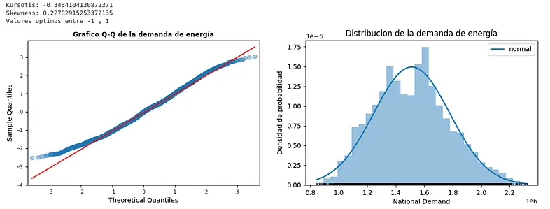
The result is a probability distribution very similar to a theoretical Gaussian distribution. Both Kurtosis and Skewness values are within the optimal parameters. In case these values were outside the intervals, we could perform a box-cox transformation on the study variable to improve both the shape of the tails and the symmetry of the distribution.
For homocedasticity, one of the most useful ways to study is plotting a scatter plot about our related field and observe the behavior of the variance with respect to the mean over the whole time series.
f, ax = plt.subplots(1, 2, figsize=(18, 6))
ax[0].xaxis.update_units(data.index)

sns.scatterplot(
                data=data,
                x=data.index,
                y="nd",
                ax=ax[0]
                )
sns.regplot(
            data=data,
            x=ax[0].xaxis.convert_units(data.index),
            y=data['nd'],
            scatter=False,
            logx=True,
            ax=ax[0]
            )
sns.boxplot(
            x=data["nd"],
            ax=ax[1]
            )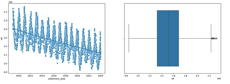
At first glance, we can see that the assumptions of normality and homoscedasticity of the variable are somewhat fulfilled. This will make the following steps much easier.
Time Series Analysis
Once we have arrived at this point, we will decompose our series into three different parts: Trend, Seasonal, and Resid. We will utilize libraries such as statmodels for this purpose.
At first, we understand trend as the increasing or decreasing value in the series, the seasonal component of the series as the repeating short-term cycle, and resid or noise as random values or variations.
data_short = data[data.index.year == 2023] #We're going to analyze only 2023
result = seasonal_decompose(data_short["nd"], model="additive")
fig = result.plot()
fig.set_size_inches((12,6))
fig.tight_layout()
plt.show()
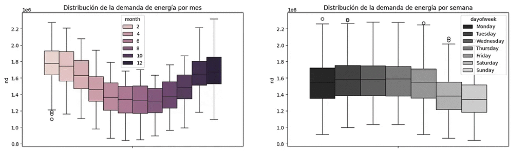
#To analyze between weekdays and months
data_months = data.copy()
data_months["month"] = data_months.index.month
data_months["dayofweek"] = data_months.index.day_name()
ordered_days = ['Monday', 'Tuesday', 'Wednesday', 'Thursday', 'Friday', 'Saturday', 'Sunday']
fig, ax = plt.subplots(1,2,figsize=(18,5))
sns.boxplot(
data=data_months,
y = "nd",
hue = "month",
ax=ax[0]
)
sns.boxplot(
data=data_months,
y = "nd",
hue = "dayofweek",
palette="dark:.8",
hue_order=ordered_days,
ax = ax[1]
)
ax[0].set_title("Distribution of energy demand by month")
ax[1].set_title("Distribution of energy demand by week")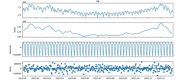
Looking at the decomposition, we can observe the following:
- Winter months are the months with the highest energy demand.
- The seasonality is constant, so a priori we can observe a constant behavior repeated within each monthly period.
- The variance of the residual can also be considered constant.
At the end, we will plot Autocorrelation order of the model. The autocorrelation function (ACF) is a measure of the correlation between the time series and a lagged version of itself.
The partial autocorrelation function (PACF) is a measure of the correlation between the time series and a lagged version of itself, controlling for the values of the time series at all shorter lags.
fig, ax = plt.subplots(1,2,figsize=(12, 3))
plot_acf(data["nd"], ax=ax[0])
plot_pacf(data["nd"], ax=ax[1])
plt.show()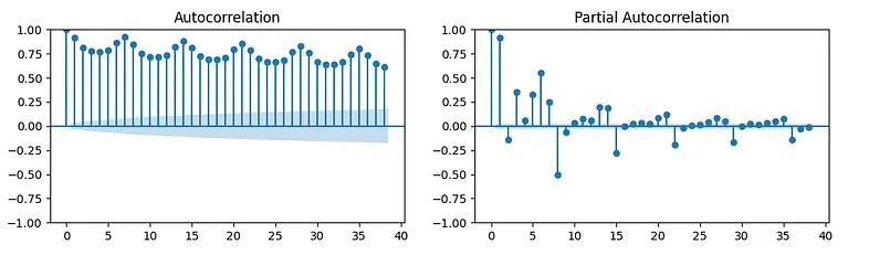
Links
https://github.com/rubgarcia97/Estadistica-Python/tree/main/Time%20Series%20Forecasting%20(I)
NIST/SEMATECH e-Handbook of Statistical Methods, https://www.itl.nist.gov/div898/handbook/eda/section3/eda35b.htm#:~:text=Skewness%20is%20a%20measure%20of,relative%20to%20a%20normal%20distribution.